Rec Room tests in production and launches critical features

| Rec Room wanted to ship features and close the loop on building, measuring and learning. Statsig lets them learn by doing - measuring KPI impact from product changes. |
|---|

Download this in PDF format: Rec Room Case Study
The Problem
"Learning whether a new feature helped or hurt gamers was incredibly difficult & time-consuming.”
That was a challenge Joel Witten, Head of Data at Rec Room set out to fix. He believed that empowering teams building features to measure the direct impact on KPIs would accelerate their learning and improve the experience for its users

The Solution
Using Statsig Feature Flags to release new features
To solve these challenges & speed up release cycles, Rec Room started using Statsig Feature Flags to rollout new features. When a feature is rolled out to a subset of users, Statsig computes impact on metrics by comparing users who have access to the feature with those who do not (A vs B).

Player Profiles
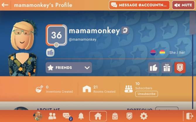
Players within Rec Room can view another player and interact with them through their profile. They can initiate chats, learn more about the person or even block them.
It hadn’t been refreshed in a few years and the team decided to update the look and feel to make it more “current”. Given that the goal was design consistency with the current aesthetic, this was not meant to be an experiment. The team was not looking to measure a bump in metrics from this change.

V0 Player Profile - "Player profiles are how players learn about. It’s time for a redesign!"
In theory every product change should have a clear, measurable hypotheses and a measurable goal. In practice – creating good products is a combination of art and science. Most of what is shipped in good products happens outside of an experiment. Being able to measure the impact of these changes creates learning when something unexpected happens – instead of being blind to it.

V1 Player Profile: UI Revamp - "The new design is so much better! People will love this!"
Surprising results
Rec Room built and shipped their new Player Profile. The new version felt cleaner, did not look dated and seemed easier to navigate. They shipped this behind a feature flag - and like with other changes - slowly ramped up rollout. What they saw next surprised them.
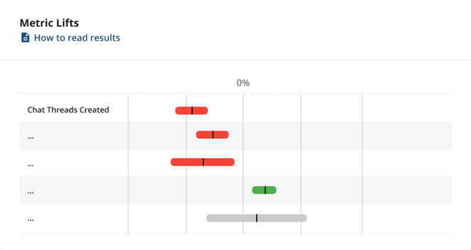
Chat messages between players dropped by over 25%. Metrics that measured healthy interaction between players dropped, which was suprising to the team. Their first instinct was that users were slow to adjust to the new experience – the novelty effect could hurt metrics in the short term, but stabilize over time. But the metrics did not improve as they waited for a few days.

"Chat messages are down 25%!? Large swings in other metrics"
Launching v2
They carefully compared new and old experiences to explain what might be happening. They hypothesized that the “Message” button was buried in the header bar and ignored by users. They prepared a second revision of the Player Profile that made this button move visible.

V2 Player Profile: Make Message Button Pop “Let’s test the hypothesis by making the message button pop”
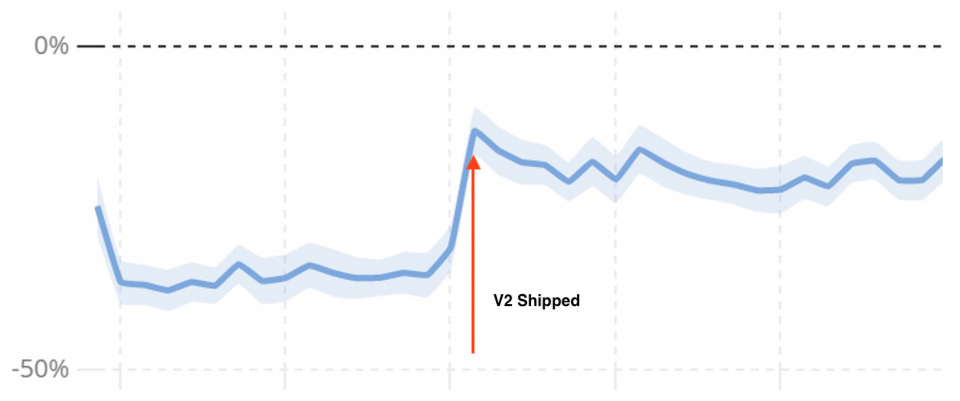
They shipped this experience and promptly saw their metrics recover partially. Messaging was still not happening as often as it was with the original Player Profile, but they were convinced they were on the right track with what was happening to user behavior.

Chat messaging between players “It worked! (somewhat)”
Third time’s the charm
The team considered the learning they had and revved their design again. They moved buttons out of the header bar where users seemed to miss them. They added labels for key tasks so users unfamiliar with icons didn’t miss them. They prominently colored the buttons they wanted to emphasize so these stood out.

V3 Player Profile: Move Button where Users Expect “Let’s make it pop more!”
The Results
When Player Profile v3 shipped, the number of chat interactions skyrocketed. They stabilized at almost a 25% bump up from the baseline. This was a dramatic recovery from the 25% drop the Player Profile v1 experience caused.
The team originally expected to ship a design refresh that improved how the product felt, with no expectation to impact near term metrics. Having product observability helped them realize that the changes regressed user engagement. Learning from this helped refine their new UI patterns and ultimately ship a better product.

Chat messaging between players - "Nice! Better design, and dramatically happier users than when we started"