Products
Solutions
Resources
Product Updates

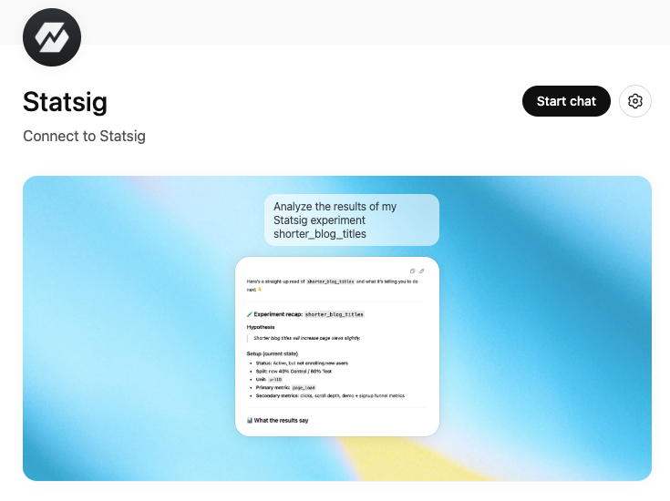
💬 Statsig ChatGPT App
We’re excited to announce the Statsig ChatGPT App — bringing Statsig into the place where more and more product work happens: ChatGPT.
Whether you’re using ChatGPT to draft analysis, experiment reviews, PRDs, user behavior studies, launch plans, or stakeholder updates, you can now pull in Statsig context directly into your workflow and take action without leaving the conversation.
What it can do
With the Statsig ChatGPT App, you can:
Bring Statsig into your analysis by pulling experiment context and results, and asking questions like “what moved?” or “what should we do next?”
Compound knowledge across your connected tools by tying Statsig data to the docs, notes, and discussions you already have connected in ChatGPT
Build a flywheel of rapid iteration by generating insights and instantly creating or updating Statsig gates, experiments, and dynamic configs, all within ChatGPT.
Why this matters
ChatGPT is increasingly embedded in the day-to-day workflows of product builders. The Statsig ChatGPT App enhances that workflow, letting you plan with real results and ship the next step immediately—all in the same thread.
Getting started
Install the Statsig ChatGPT App.
Connect your Statsig workspace (you’ll be prompted to authenticate).
Start exploring — and shipping.
For more setup instructions, see our docs page.
Try these prompts
“I’m writing an experiment review — pull the latest results and context for [experiment name] and draft a summary.”
“Based on this PRD, create an experiment with two variants and the key metrics we mention.”
“Create a feature gate for [feature] and roll it out to 5% of users in [segment].”
“Create a dynamic config called [name] with these keys, and suggest a safe rollout plan.”
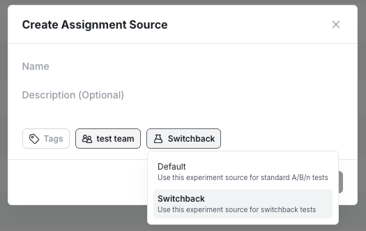
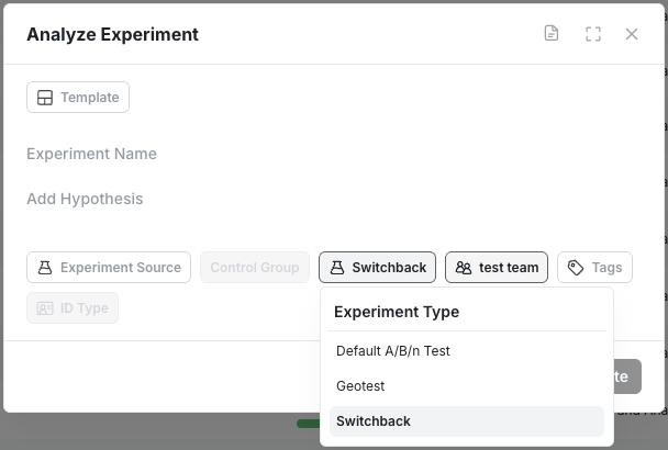
🎚️ Analyze Only Switchback in Beta
WHN customers can now provide their own Switchback assignment data for a regression based analysis in Statsig. This allows users to have maximum flexibility by controlling their own assignment method while leveraging already existing metric data in Statsig.
To get started you will need to first create a dedicated assignment source for Switchback experiments.
And select Switchback as an Experiment type in the Analyze Only experiment creation modal.
The feature is available today in beta. If you’re interested in learning more or need help getting started please reach out to us via Slack or through your account manager!
📓 Composite Metrics
WHN users can now create Composite Metrics in Statsig. Composite Metrics let you define a single metric as the sum or difference of multiple value aggregations.
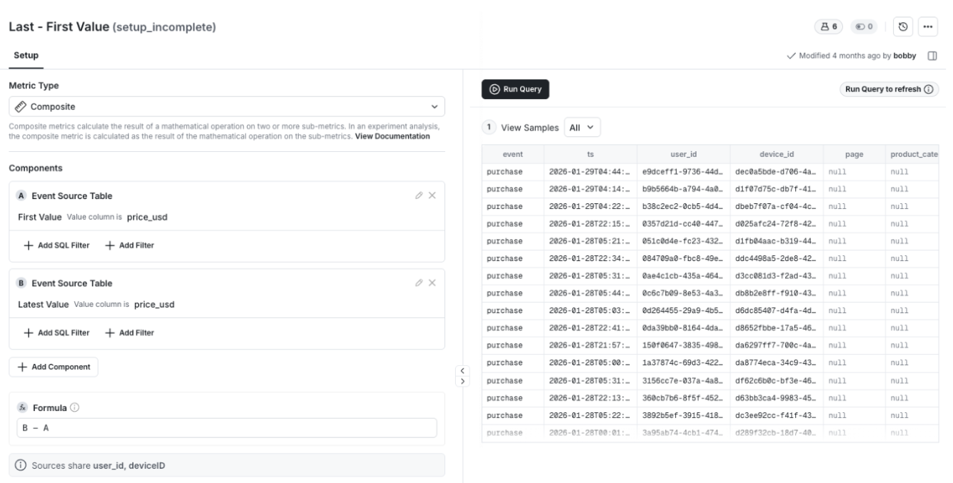
Use to:
Measure net impact (for example, gains minus losses)
Compare the differences between values (last/first or max/min)
For added flexibility, you can break out components of a composite metric in your experiment results.

The feature is available today. Visit the docs page to learn more.
🔐 Clear, Flexible Privacy for Session Replay
Overview
We introduced a clearer, more flexible set of privacy controls for Session Replay. You can choose a baseline privacy configuration and refine it with element-level rules. This makes it easier to align replay collection with your organization’s privacy requirements while preserving useful context for analysis.
What You Can Do Now
Select one of three baseline privacy options that define how text and inputs are handled by default.
Apply CSS selector rules to mask, unmask, or fully block specific elements.
Manage all replay privacy settings from a single place in the console.
How It Works
You begin by choosing a baseline privacy option in the Statsig Console UI. This sets the default masking behavior for all session replays.
Baseline privacy options:
Passwords (Default): Only password inputs are replaced with asterisks (*). All other text and inputs are shown as is.
Inputs: All text inside input fields is replaced with asterisks (*). All other text is shown as is.
Maximum: All text and all inputs are replaced with asterisks (*).
After selecting a baseline, you can add CSS selector rules to override it for specific elements. Selector rules follow a strict precedence order: Block, then Mask, then Unmask. Password inputs are always masked and cannot be unmasked.
Blocking removes an element entirely from the replay and replaces it with a black placeholder of the same size. Masking replaces text with asterisks. Unmasking reveals text that would otherwise be masked by the baseline setting.
All settings are configured in the Statsig Console under Project Settings → Analytics & Session Replay and require project admin permissions.
Impact on Your Analysis
These controls let you confidently use Session Replay in privacy-sensitive environments. You can protect PII by default while selectively revealing safe UI elements for debugging, without sacrificing visibility into user behavior.
⏱️ Background Queries in Metrics Explorer
Longer-running queries no longer block your workflow. Metrics Explorer now supports background queries, giving you a dedicated experience for queries that take longer to complete.
What You Can Do Now
Kick off queries that continue running even after you close the tab or switch tasks.
Avoid timeouts for complex or large queries.
Track queries that are still running from a central, visible place.
How It Works
When Metrics Explorer detects that a query will exceed typical execution time, it automatically runs it in the background. You are free to navigate away or close the browser without interrupting execution. In-progress background queries appear in Metrics Explorer under the breadcrumb menu at the top, where their status is clearly labeled.
Impact on Your Analysis
You can confidently run heavier queries without worrying about timeouts or keeping a tab open. This makes it easier to explore larger datasets, iterate on complex funnels, and parallelize analysis with other work.
📏 Count Distinct Metric in Cloud
We’re excited to announce the Count Distinct metric type for Statsig Cloud. Count Distinct lets you measure unique entities—like transactions, devices, or pages views—by counting unique values across the experiment window.
The Count Distinct metric is a sketch based metric that relies on probabilistic HyperLogLog++ (HLL++). We chose this approximation method to optimize for efficiency and speed. Visit our docs page to learn more about our implementation.
It’s available starting today.
🗺️ Explore Multi-Dimension Group By
For Statsig WHN customers, you can now explore your experiment results in greater detail by grouping the results by up to three user properties.

With Multi-Dimensional Group By, you can break down results by combinations like country × device × plan all in one view.
This expands your ability to find interesting insights and data trends at a greater granularity.
Try it now in the Explore tab of your experiments.
🕵️ AI Knowledge Bank Search [Beta]
For our WHN customers, we’re excited to announce the beta launch of this AI-powered search capability.
With AI-Powered Search, you can now search your repository of experiments using natural language. Try asking questions like “find me experiments that impacted retention the most” or “have we tested using AI for support”. The new search feature will then return three of the best-matching experiments to your question.

If you’re interested in becoming an early tester of this feature, please reach out to us via Slack or through your account manager!
🚀 AI-Powered Experiment Summary
We know writing an experimentation report is everyone’s favorite activity. For those who don’t, it just got easier with Statsig.
With AI-Powered Experiment Summaries, Statsig automatically turns your experiment data into a clear, human-readable summary. The AI summary works to understand the purpose of the experiment, make a ship recommendation, and highlight the most relevant metric observations.

This feature is available now for all Statsig customers. To enable, go to Setting → Statsig AI → AI Summary.
AI Stale Gate Cleanup
Until now, Statsig only detected feature gates that were no longer active and marked them "stale." With new Github AI Integration, you can directly generate a pull request to remove the dead code from Statsig UI in one click.
Why This Is Valuable
Cleaning up dead flags is usually painful and gets deprioritized. This turns it into a one-click workflow:
Click “remove from code”
Review the generated PR
Approve and merge
Teams reduce flag debt without risky manual cleanup.
Getting Started
Connect Statsig to your Github Org account to enable AI-powered stale gate code removal.