🌸 Dashboards Spring Cleaning
🌸 Dashboards Spring Cleaning
We've recently made some quality of life improvements to help you find dashboards more easily and quickly derive meaningful insights.
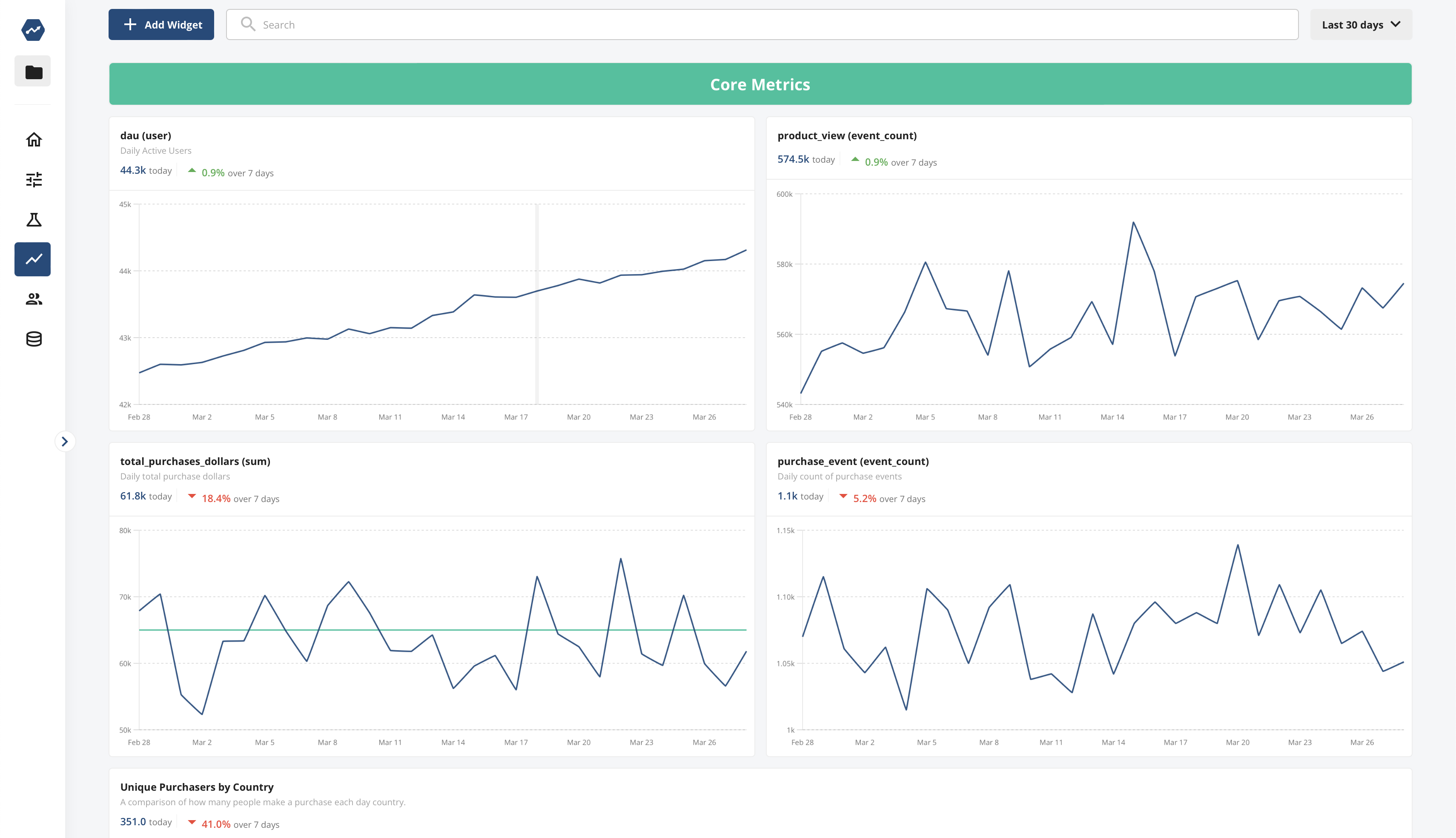
Dashboard Summaries and Settings
When viewing dashboards, we've made it simpler to grasp the most important insights at a glance. Charts on dashboards now, by default, show the latest metric value and the percent change over time for the metric being plotted. This makes understanding current product health more straightforward than ever. You can also edit the summary value being display as the latest value, average value, or cumulative value of the metric over the time range.
Favorite Dashboards
You can now mark dashboards as favorites if they are particularly important to you. Your favorite dashboards will always appear at the top of your dashboard list, making them easier to access and ensuring you quickly get to the data that matters most.
Popular Dashboards
We've also added a new "Popular Dashboards" section to the dashboard list view. This feature makes it easy to discover dashboards that are popular within your project, helping your team share insights and context around the dashboards and product data that are proving most insightful.

Loved by customers at every stage of growth


