Products
Solutions
Resources
The story of how we are able to move fast and work effectively at Statsig.
Background
I joined Statsig as the first designer when there were already a team of Ex-Facebook engineers that were actively building out the product. Before I joined, the team relied on Google’s Material Design Component Library. This allowed them to move fast and focus on building the core product without worrying about constructing custom components.
When Alex Coleman — one of our software engineers — gave me a quick product tour, I immediately identified several areas that needed a designer’s magic touch. However, instead of redoing visuals and UI/UX inconsistencies, I focused on identifying recurring UI patterns and systems, as well as layout and core user flows.This was a very intentional decision that I made in order to assess and evaluate the need for a design system.
Motivation
To start off, I had two choices:
I could continue to build on top of what has already been built or,
I could establish a design system from scratch and face-lift the product.
After careful thought and discussions with the team, I ultimately decided to build a new design system.
At an early stage startup, putting time and energy into establishing a design system could be costly and risky. Because the product is still in its exploration stage, working towards product-market fit, proving out product features is more important than prettifying and standardizing the overall product experience. With the potential of sudden pivots and continuous iterations, a design system could be restrictive and slow down the product team.
At Statsig however, I thought our situation was different. I saw more upside in investing in a Statsig design system for the following reasons:
Despite being an early-stage startup, we had a strong conviction in our product from our experience at Facebook.
Across the product experiences overall, there were many noticeable inconsistencies (fonts, colors, usage of components etc) that would continue to exist as product development and iterations happen
Due to the nature of the B2B tool, there were many overlapping usage of common components (dropdowns, buttons, input fields, modals etc) with different states that could benefit from having an established, consistent design system
The progress made by the team was still in a relatively early phase that iteration and adoption of the entire design system would pose less risk and effort with a higher upside (such as, increasing the effectiveness of design & engineering collaboration, UI/UX consistencies throughout the product experiences and more)
Goal
From working at Facebook for three years, I learned how powerful a good design system can be for both designers and engineers. At Facebook, the design system allowed the teams to quickly iterate on problems with a consistent product-wide user experience.
At Statsig, we had two goals for the Statsig design system:
Internally, we wanted to move fast and focus on our product’s development.
Externally, we wanted to deliver a consistent experience that conveyed trust and confidence to potential and current customers.
*Quick call-out —
The objective wasn’t to build the best and final Statsig design system. We acknowledged the ongoing future evolution of our product and the need for the design system to be more flexible rather than to restrict the engineering process or welcome new creative ideas.
Process
#1. Research & Understand
Audit the current product experience looking for common and overlapping patterns.
Research and seek out inspirations from competitor products and other B2B products to identify common approaches and patterns used (my experience on Facebook Ads really helped)
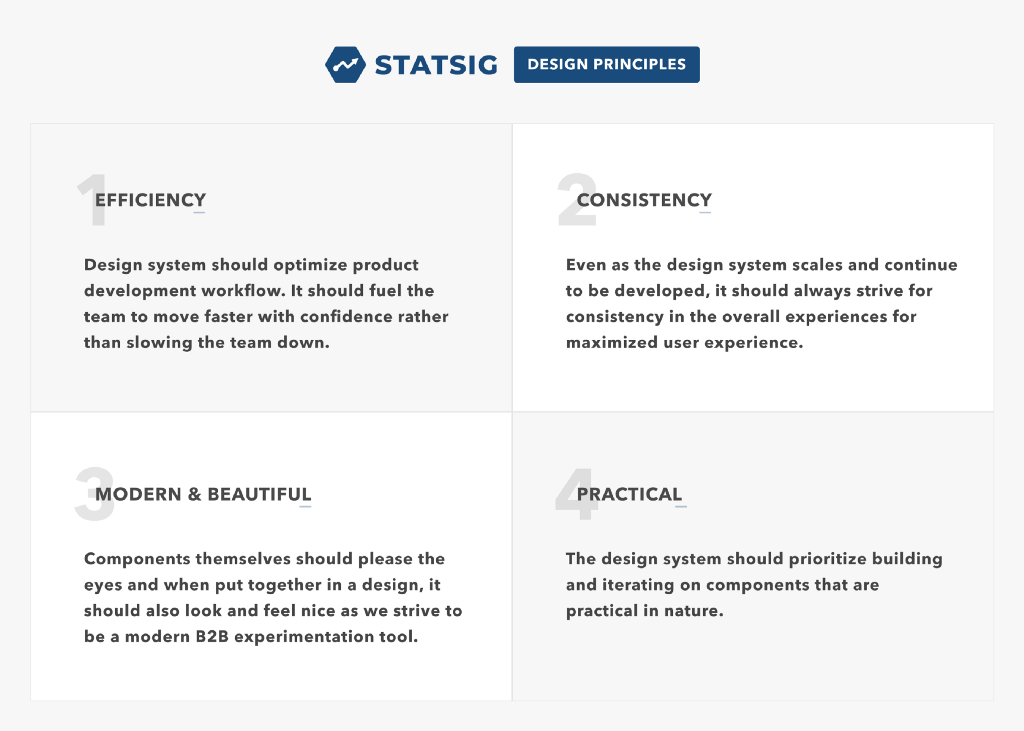
#2. Establish design principles
#3. Define basic necessities
Typeface & sizes
Colors
Icons
Core layout
#4. Organize components to build with prioritization
Group one — input fields, buttons, dropdowns, nav system, modals
Group two — toasts, badges/pills, NUXes, tooltips, hover cards
Group three — graphs, charts, tables, card templates
#5. Review
Check to see if Master/Instance components work well
Check to see if auto-layout works well
Check if styling change applies appropriately
Check for any changes needed to individual components
#6. Hand off to engineering & continuous iteration
See the design system in action for any updates needed
Receive & act on feedback
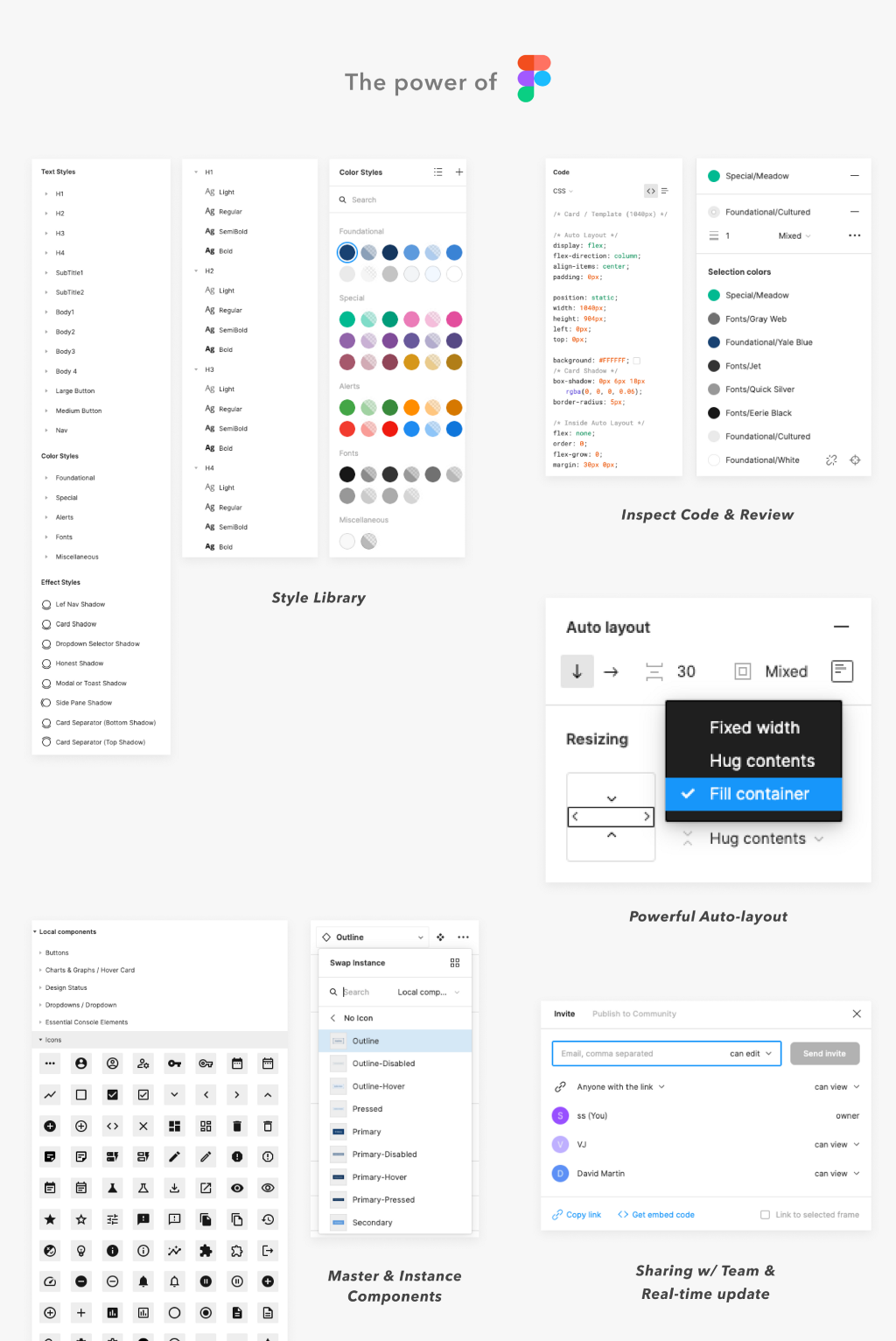
Method — why Figma?
A few months before I departed Facebook to join Statsig, there was a rapid movement to switch from over from Sketch to Figma for many convincing reasons. With the ability to create components, style libraries and utilize the power of auto-layouts, there was no reason not to continue to use Figma at Statsig.
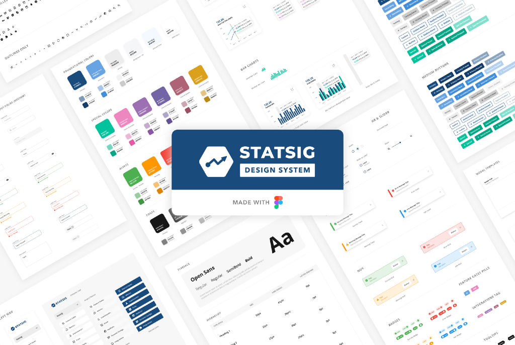
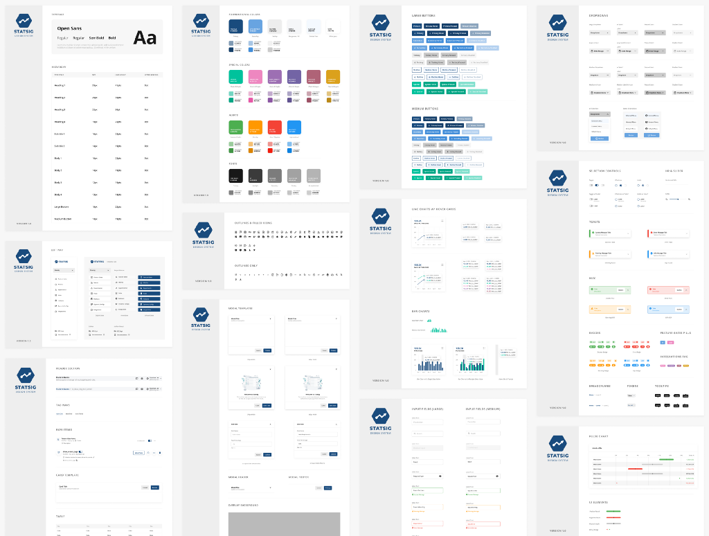
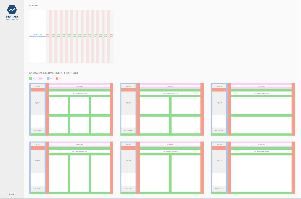
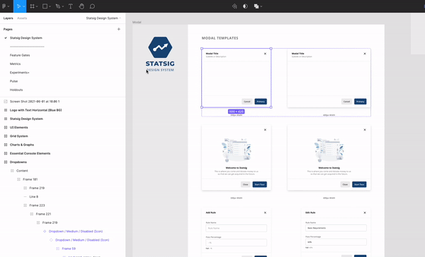
Statsig Design System
Here are some snapshots of our current designs.
Master Component Library
Basic Grid Layout
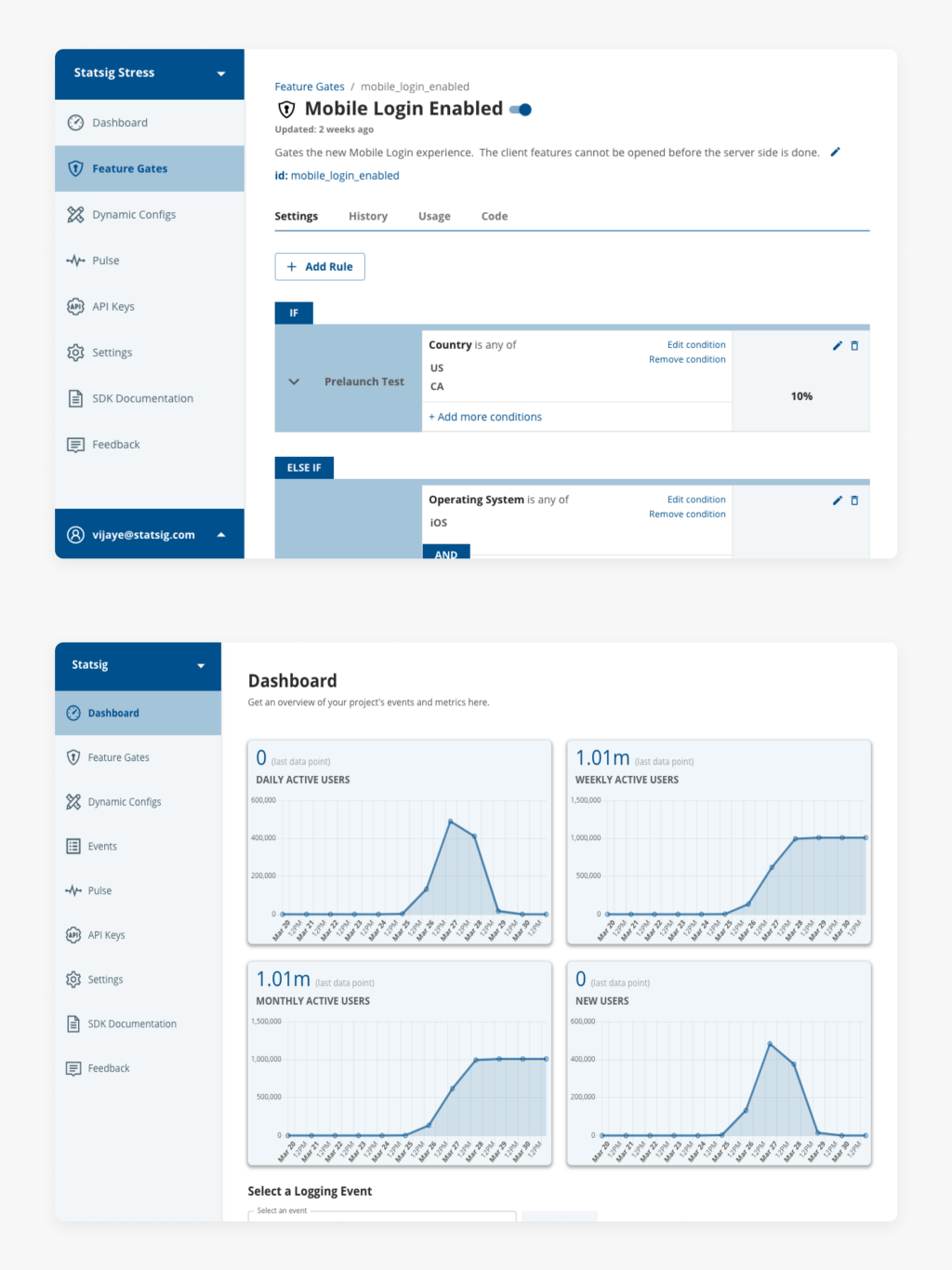
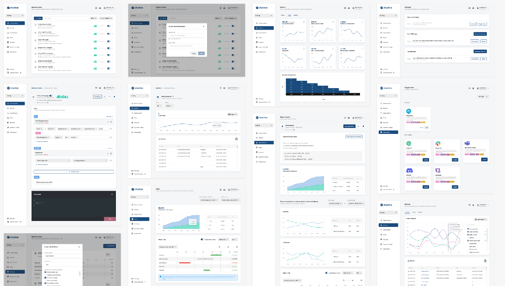
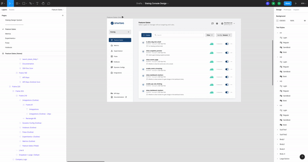
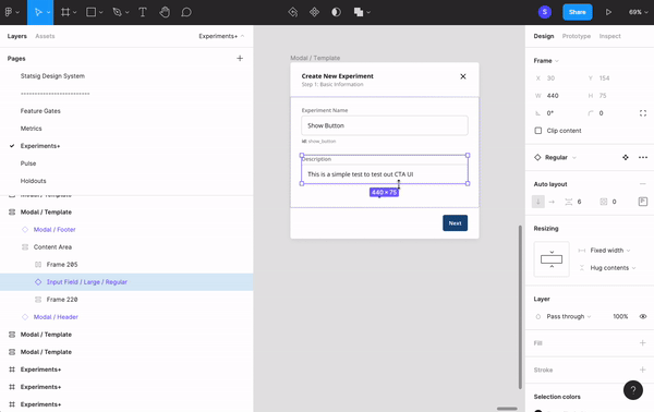
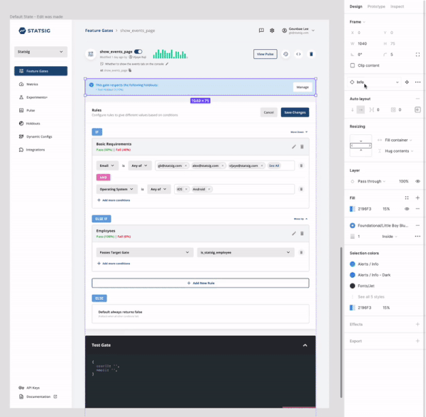
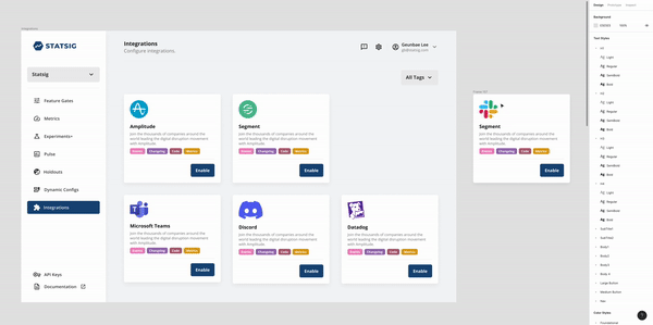
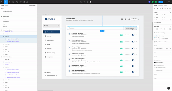
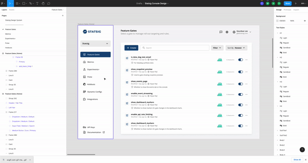
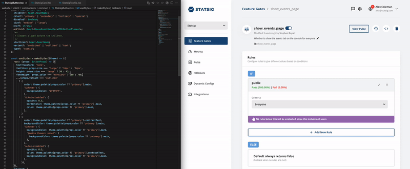
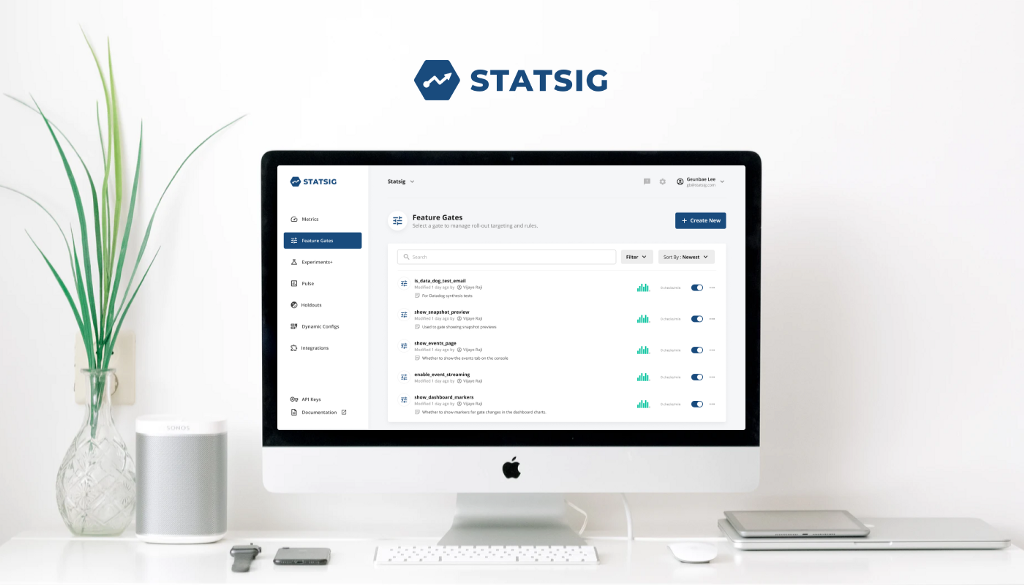
Components in Action inside the Product (Images)
Below, is a snapshot of some of the design system components in action in real product experiences. We’re continuing to iterate on our product and the design system makes it really easy to do so.
Components in Action inside the Product (Example GIFs)
Learnings
Frankly, this was my first time building a new design system from ground up. My Facebook experience inspired the confidence and process for building one for Statsig. It definitely took some time and effort but now, we’re experiencing a much faster and more effective collaboration across design and engineering. And with the new look across our product features, we hope to continue achieving a good user experience from our customers.
Furthermore, we believe that the approach to how we develop and iterate on products will carry on as a part of our culture that could help new hires to quickly adapt to our product experiences. Last but not least, it also helped me to increase my proficiency in Figma.
Thanks for reading! 🙏
Appendix: About Statsig
In February of 2021, Statsig was founded with an office located in Kirkland, WA. Our mission is to “help people use data to build better products.” With the tools we provide as a service to analyze, visualize and interpret data, our ultimate goal is to help product teams ship their features more confidently (Here, is an article of how it started).
The product we offer today is a faithful replica of the growth infrastructure utilized inside Facebook that allowed it to grow to more than 2 billion users. You can read more about it in these articles we published in the past (articles related to: Feature Flag, Pulse, Holdouts).
Currently at Statsig, a talented team of ex-Facebook employees who have experienced the internal tools that enabled teams to move fast and helped in the decision-making process of feature launches are actively working on bringing the power to everyone.