Products
Solutions
Resources

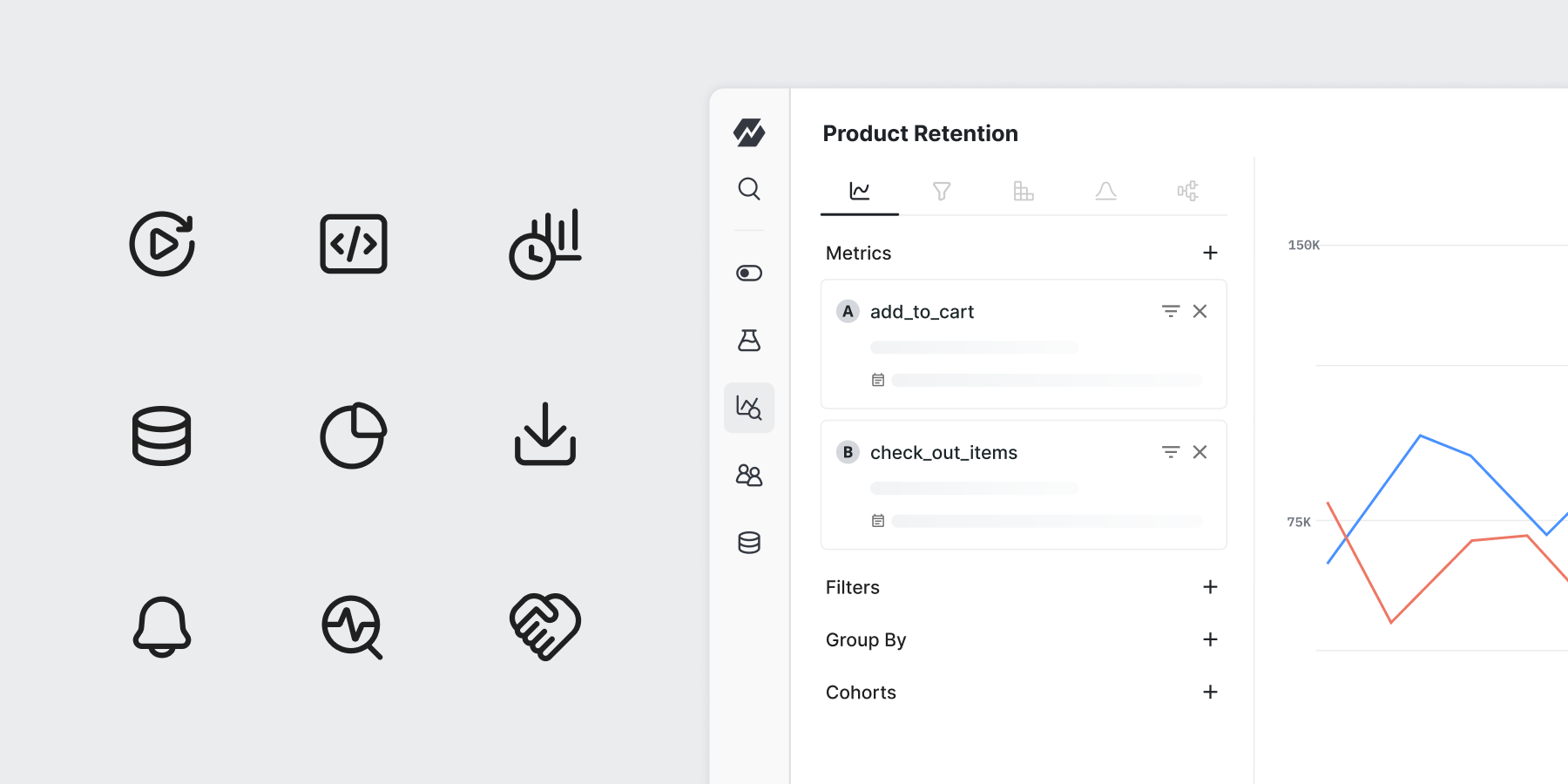
In case you missed it, we recently rolled out a fresh set of icons in our product UI.
Since the inception of our product in 2021, we have taken from the Google Material Icon Library. While they served us well over the past four years, we saw a need to refresh them to better align with our recent brand evolution. With that, we’re excited to introduce the new Staticons.

Key considerations and inconsistencies that we addressed
We took a closer look at the various ways our icons were used across the UI and identified the following opportunities to simplify the icon system overall:
We have made all icons outlined and removed their filled counterparts.
Icon sizes are now standardized: 16x16 and 20x20 for the majority of the UI, and 24x24 for complex features only.
We reduced the stroke width of icons to lighten their visual weight and improve proportions when paired with typography.

In the redesign process, we considered a range of directions. One approach we explored was a loose, illustrative style that leaned into the playfulness of our brand’s new Scribble imagery.

However, we were met with legibility challenges when scaling the icons. We also wanted to prioritize recognition and usability for a smooth transition.
Ultimately, we chose a simple style that preserves our personality even at a small scale. Replacing the sharp edges of MUI icons, we designed Staticons with more roundness for an approachable look that reflects our supportive presence in the product. In appropriate areas, we also embraced the opportunity to inject fun elements into the icons.
Shiny new design guidelines
When we were first building our product, our icons were intentionally set at 24px to help the UI look more full. With a more robust product today, our UI became more compact which begged for smaller icon sizes.
We started scaling icons down to 16px and 18px in code which introduced inconsistencies in their weight.
One key difference is that we are now maintaining icons in only two weights:
16px and 20px using a 1.25px stroke width (default)
24px using a 1.5px stroke width (special cases)

We also implemented a 2px padding rule for 20px and 24px icons to maintain a visual alignment and prevent crowding—with an exception for 16px icons
Given the complexity of our product and the need to accommodate different functionalities, the padding rule would reduce the usable icon space. We allow 16px icons to extend closer to the edges, preserving clarity and recognizability at this smaller size.

Implementing our icon creation flow in Figma
Figma is the primary design tool we use at Statsig, and we used it to build the entire icon library. This allows designers to benefit from full transparency into the icon design process, including its history, explorations, and variations.
To ensure scalability, we maintain both editable vectors and flattened versions in Figma, making it easy for anyone to access and build upon existing icons.
Looking forward
We’re excited for our users to experience Staticons in the product! As we move forward, we will continue refining and identifying areas to enhance simplicity and usability to best empower your product-building journey.
Request a demo