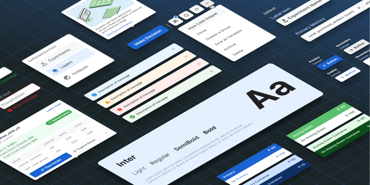
We’re refreshing our design system. Here’s what it’ll look like, and how it will help you work faster.
Over the past few years, Statsig has grown significantly, adding multiple products and features to our platform.
As our company has scaled, we’ve faced challenges in making our product feel more focused and approachable for a broad range of users. We wanted to create a consistent foundation for our existing products and those yet to come.
The new Pluto design system is an effort to simplify and enhance your experience with Statsig.
The foundation
Designing a B2B product presents unique challenges, but our goal is to create a design system that serves both current and future needs effectively.
Our design decisions were based on whether an experience met these criteria:
Intuitive: Ensuring that users can navigate and use the platform effortlessly.
Seamless: Creating a smooth and coherent user experience across all features and products.
Trusted: Building a reliable and secure platform that users can depend on.
Delightful: Making the interaction with our product enjoyable and satisfying.
Scalable: Designing with future growth and additional features in mind.
Key changes
The new Pluto design system is designed to streamline your workflow and enhance productivity. Here are the key updates in the new Statsig.
Navigation
Statsig in 2024 is a far richer product than in 2021.
We've recently added new product surfaces like Product Analytics and Session Replay, and we have more to come. Experimentation has added features ranging from Meta-Analysis to Stratified Sampling. Feature flag creation lets you configure automated rollouts, ownership, and change approvers.
The new look aims to keep Statsig friendly and easy to use even as we add this power.

New layouts
With the increasing complexity of data and the growing demand for actionable insights, our previous layout began to feel restrictive.
We realized that users needed more room to view detailed visualizations and carry out actions without having to deal with unnecessary clicks or screen clutter. Our goal was to make it simpler for users to understand and interact with data while also minimizing the number of steps needed to perform important actions by optimizing the layout.
Overall, the redesign focused on enhancing the user experience by creating a more intuitive and seamless interface.


Creation modal
We've redesigned the creation model to be lightweight and prioritize speed and simplicity.
The clean and minimalistic interface reduces clutter and focuses on the essentials, making it easier for you to complete the tasks.
By stripping away unnecessary elements, we have created a faster, more responsive experience that lets you get your work done with minimal effort.

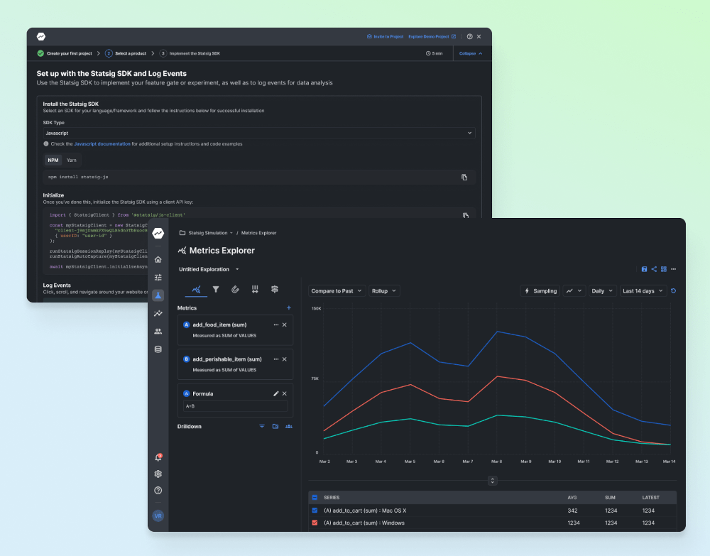
Better dark mode
We’re all about making your experience as seamless and enjoyable as possible, and we know how important dark mode is to many of you. Whether you’re working late or just prefer a darker interface, we’ve got great news—Statsig’s dark mode just got a whole lot better!
We’ve focused on improving the balance between dark backgrounds, bright text, and data visualizations ensuring that every element is easy to find and interact with, even in low-light conditions.

Scalable and consistent components
Consistent and predictable components help users feel more comfortable navigating the platform.
As Statsig grows and new features are continuously added, a unified and scalable design system ensures that the design system can handle increased complexity without becoming unwieldy.
This scalability is crucial for supporting long-term growth.

When will the new UI updates be available?
The new Pluto design system is being gradually rolled out in phases, starting this August. Our goal is to ensure a seamless transition for all customers, so we’ll be providing detailed guides and support throughout the process.
Stay tuned for more updates and be sure to check out our blog and support channels for the latest information.
Get started now!

