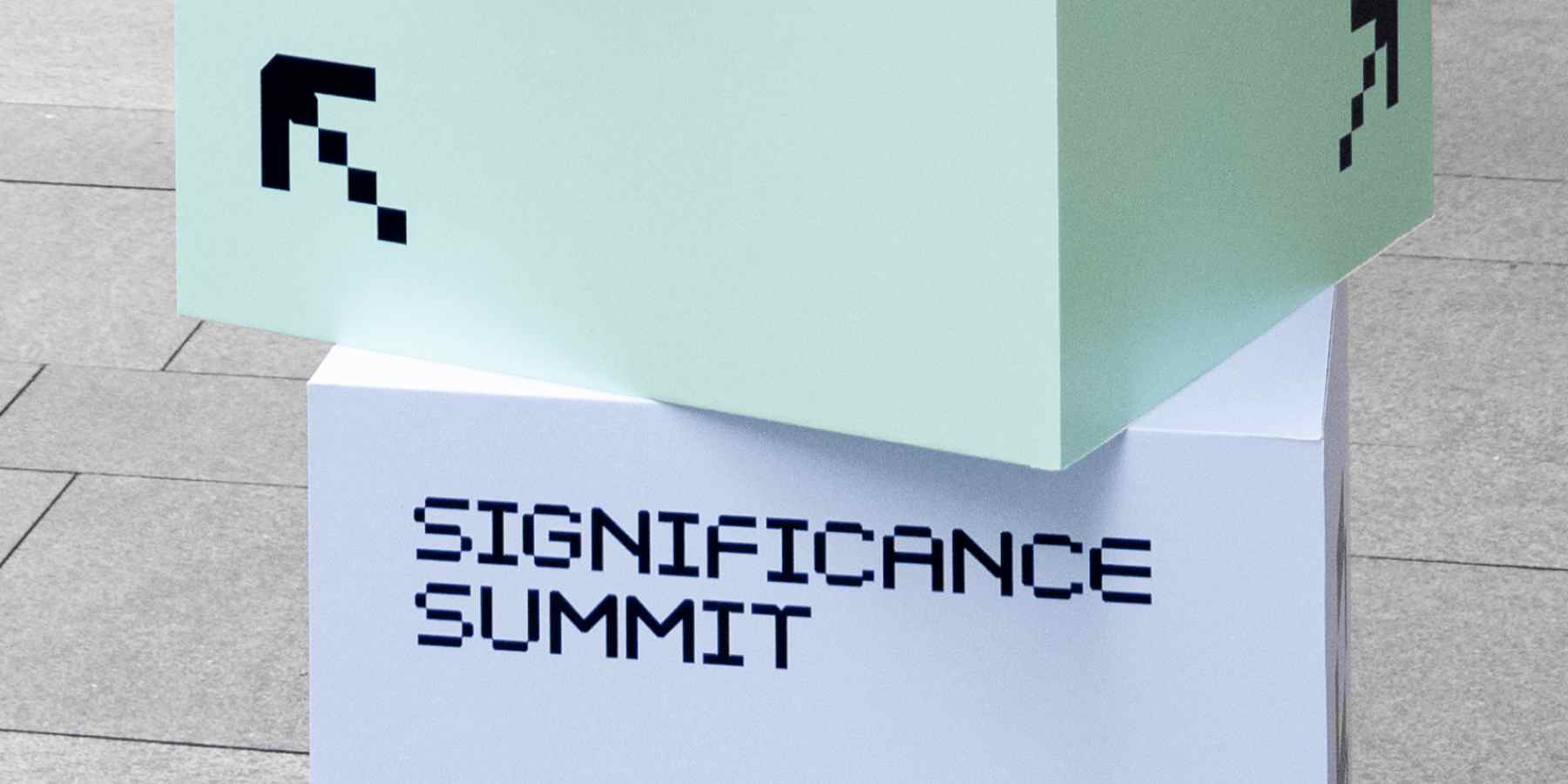
Last week, Statsig hosted its inaugural Significance Summit in SF at the Nasdaq Center.
The summit was a full-day agenda of fireside chats, panels, and interviews with industry leaders on topics focused on data-driven product development.

As a brand team, we created the visual identity and supported all visual deliverables of the conference. It had to feel standalone from Statsig’s main brand, but still within the visual language.
The challenges we faced were inherently unique, being that we are a startup: the brand team is two people, we had a tight budget, and how do you even make a data and eng-focused audience care about design anyway?
Building your foundation: Know your audience and stakeholders
Tap into the everyday life of your audience to find relatable visual cues.
This practice inspired us to use the smallest visual unit in digital displays—the pixel—as our conceptual building block. We created a custom pixel wordmark that would serve as the foundation for the rest of the visual identity.

While a pixel is essentially a square, adding notches that mirrored the wordmark created unique shapes that we used playfully throughout the system. By using a 5x5 grid and playing with these shapes, we developed a set of icons that were used illustratively to highlight information and add texture.


To make a relatable visual identity, you need to understand what your audience cares about.
We often looked to our data and engineer coworkers for feedback. People react quickly and emotionally. It's important to identify things our audience would not be able to move past.
For us, that invisible wall was legibility, so we pivoted some initial concepts: Some of our old designs broke apart words and the logo wordmark in playful ways that were ultimately too abstract. Instead, we had to find other ways to add gesture and texture.
Scaling up: Maximize visual impact with a tight budget
The visual identity had to consider various scales. Being a data conference, we incorporated minimalistic and colorful illustrations of charts that suggested the narrative of data throughout all the touch points. We animated these illustrations for the main screen to create visual impact.
To evaluate what surfaces would create maximum visual impact for the best price, we considered:
The focus points of the event: The day would mostly revolve around the main screen. Backwalls or floor decals would not be as impactful as focusing our energy on the main wall and screen graphics.
Optimal photo and video results: Putting ourselves in the perspective of the photographer and videographer, which surfaces would work together to provide the most complete image when the event is over?


The pros and cons of a tiny team
A small team (one event lead and two brand designers) with no outsourcing comes with its own benefits and challenges.
Close relationships are soil for creativity. 🌱
Our team sits next to each other every day due to our in-office culture. Ideas naturally come out of casual chit-chat and staring at each other’s screens. It’s a blessing to be able to suggest things without fear that someone would shut you down or quietly think it’s a dumb idea.
We could try things out and inherently trust that we would have each others’ back to figure out the best possible solution if something didn’t pan out as expected.
Some of our favorite assets from the event came out of this dynamic: The use of stackable boxes as signage and the extra care ($$$) put into our conference guides were all direct outcomes of this trust.
On the other hand, having such a small team also meant less time allocated for design. Knowing we had a high volume of work and had to juggle multiple roles meant we had to pick our battles and compromise time for design exploration to stay on track and execute.

Have the courage to be imperfect
If you’re from an agency or are used to working in-house at a larger company, you usually have a full team on a given project.
It’s even common to outsource specialized talent. This not only ensures the quality of work and skill coverage, but also reduces potential oversights or mistakes throughout execution.
Doing a first-time event with a tiny team means mistakes will happen. However difficult, it's important to try to anticipate the key things that could go wrong and have a contingency plan—even if it means throwing away your work. The key is to not dwell, as this only burns time, resources, and mental energy.

When you're used to seeing the output of skilled experts, it’s easy to doubt yourself and shy away from shipping something you just learned in After Effects 5 minutes ago. Being at a startup means there is no time for imposter syndrome. You'll have to fill in all of the gaps and learn on the spot.
Measuring yourself against perfection is a surefire way to stifle your own growth. Just do it, ship it, get feedback, and do better next time. It’s refreshing to remember your capacity to learn after working on larger teams for so long. Our design team learned so much from this experience, from production to motion design.

The entire team rallied together outside of their comfort zone on the day of the event. Our product manager, Akin, took on the role of M.C., our sales team helped guide event attendees and manage check-in, and the design team helped control all of the audio/visual on the main stage and ushered speakers.
It was a one-of-a-kind experience that you can only get at a scrappy startup.


Watch Sigsum on demand

