How my first project—the Home tab—has evolved since its inception as a simple overview.
A few weeks ago, I celebrated one year at Statsig as a full-time employee and one year out of college. This personal milestone coincided with the announcement of our new and improved console Home tab.
Coincidentally, this was the first project I ever worked on at Statsig as an intern two years ago. What a great time to take a look back at the evolution of the Home tab
This made me think about how the transformation of Home, in some ways, parallels my journey. Let’s take a look back at all the evolutions to our Home tab. A lot can change in two years.
What’s in a home?
When I began my journey with Statsig as an intern, our console had just started growing from a feature flagging tool into what it is today; a toolbox for feature flagging, experimentation, and now, product analytics.
When users logged in, they would see a list of feature gates, and it was clear that this landing experience lacked context on how users could best leverage Statsig.
As we added more features, we wanted users to land in an experience that made it straightforward to ramp up on these new tools. As a result, I was tasked with building a “Home.”
At this point, the word we used to illustrate the goals of the Home tab was “overview.” The Home tab was intended to achieve two basic goals:
Help new users understand the many tools at their fingertips, and
Allow current users to stay engaged and informed on the most relevant updates from their projects.
To achieve these and build a thorough “overview,” we built a project updates feed (which pulls from our website), an experimentation velocity chart, and entry points for our many tools, including feature gates, experiments, dynamic configs, metrics catalog, and more.

As an intern, I was not only thrilled to build something that would be seen by customers every time they logged into the console, but also grateful to work on something that allowed me to gain a breadth of understanding of Statsig’s tools, as well as our customers’ needs.
From “overview” to “custom”
So, this summer, when I was asked to work on a “Home V2” project, I was excited to go back and revamp the first thing I had ever built at Statsig.
As we discussed the changes to be made, I couldn’t help but feel a bit sad about ripping out the Home tab I had spent all summer building. Still, it was clear that Home needed a refresh; not only had our product matured in depth and breadth, but our customers had grown as well.
As a platform for building products, we needed to support their continued growth on our platform by providing easy access to the most high-signal information and most useful tools. We had graduated from needing an “overview” tab to an experience optimized per user.
Our new focus word was “custom.” Our updated goals were
Surface personalized updates, and
Support the transition of users from low to high engagement
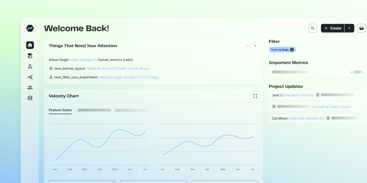
We scoped, built, and launched the new Home to customers within a few weeks. The latest Home tab exposes more personal tools and information, including dashboards, recently visited items, and customizable widgets, while preserving many original features including velocity charts and project updates.


As our product has matured, and our customers become more engaged in our tools, the goal of the default landing experience evolved.
At first, we needed to provide context—show users an overview of the tools available. Now, we needed to make it as effortless as possible for users to get value from those tools.
Instead of providing links to their dashboards, show the user their preferred dashboard so that the first thing they see is data that they care about. Instead of curating a feed of project-wide updates, allow the user to configure their home with the widgets that have the quick links and data that are most relevant to their role.
The new home tab
To date, I'm proud to announce that the home tab offers:
The ability to create and manage teams
Configuration of team settings such as default monitoring metrics, allowed reviewers, and target applications
Association of every config created by a user with their default team
Filtering capabilities for Gate/Experiment/Metric list views by Team
A tailored Home Feed that can also be filtered by Team
Revision as growth
“Do it right the first time” can be overrated.
Going back and re-doing something you put a lot of effort into can feel a bit painful. However, from building Home as an intern to building it as a full-time engineer, I’ve recognized that if you don’t need to revise and improve, your product probably hasn’t advanced very much.
In true Statsig nature, I acknowledge that we move fast and grow fast. In another two years, the Home tab will likely look completely different as we hit more and more growth milestones.
But for now, I’ll appreciate the journey in its evolution from an overview to a customized command center, and everything I learned along the way.
Get started now!

