Eureka! Genius has struck you like a bolt of lightning on a pitch-black night:
Your landing page absolutely needs cloud imagery, you’ve decided.
You try to explain it to your brand designer, but she doesn’t seem to understand. Your landing page is targeted, and the target audience has a very specific mindset. And that mindset involves big, puffy cumulus clouds—you’re sure of it.
Inconveniently, the brand designer has her own ideas: “I was thinking that a minimal vibe would speak to website visitors. Short text, basic aesthetic imagery, and a prominent ‘get started’ button will probably get our users clickin’,” she says.
And now you are at an impasse. Even your "please, I saw it in a dream" plea is unable to change her mind. 😖 What do you do now?
Well, it's time to talk about A/B testing.
Skip ahead:
What is A/B testing?
A/B testing is the simple act of testing two different variants and seeing which one performs better. According to Nicolai Kramer Jakobsen, A/B testing has been recorded as far back as 1753, in James Lind’s Treatise of the Scurvy.
Get a free account

Long story short, Lind was a doctor who performed clinical trials to treat scurvy for the Royal British Navy. Lind had 12 sailors with scurvy, so he paired them up, and gave different treatments to each pair. He discovered that the pair treated with a lemon and two oranges made a full recovery. Yes, science was really bleak back then.

Later, the term A/B/n test would be created to describe tests like this. What’s the difference between an A/B test and an A/B/n test? Well, an A/B test is a test between two things—thing A and thing B—and an A/B/n test is a test between more than two things: Things A, B, C, D, … N.
What makes A/B testing so ubiquitous (and special) is that the metrics that are used to determine success can be whatever the experimenters choose. In Lind’s case, the metric would be whether or not the scurvy symptoms went away. In the cloudy landing page example, a metric might be CTA clicks, or pageviews per session.
Pro tip: To avoid testing too many random things, we recommend forming a communicable hypothesis for each variant of an A/B/n test.
On web pages specifically…
These days, marketers and frontend teams run all sorts of tests on web pages. The small things can make a big difference, and oftentimes those small things aren’t even considered by content creators.
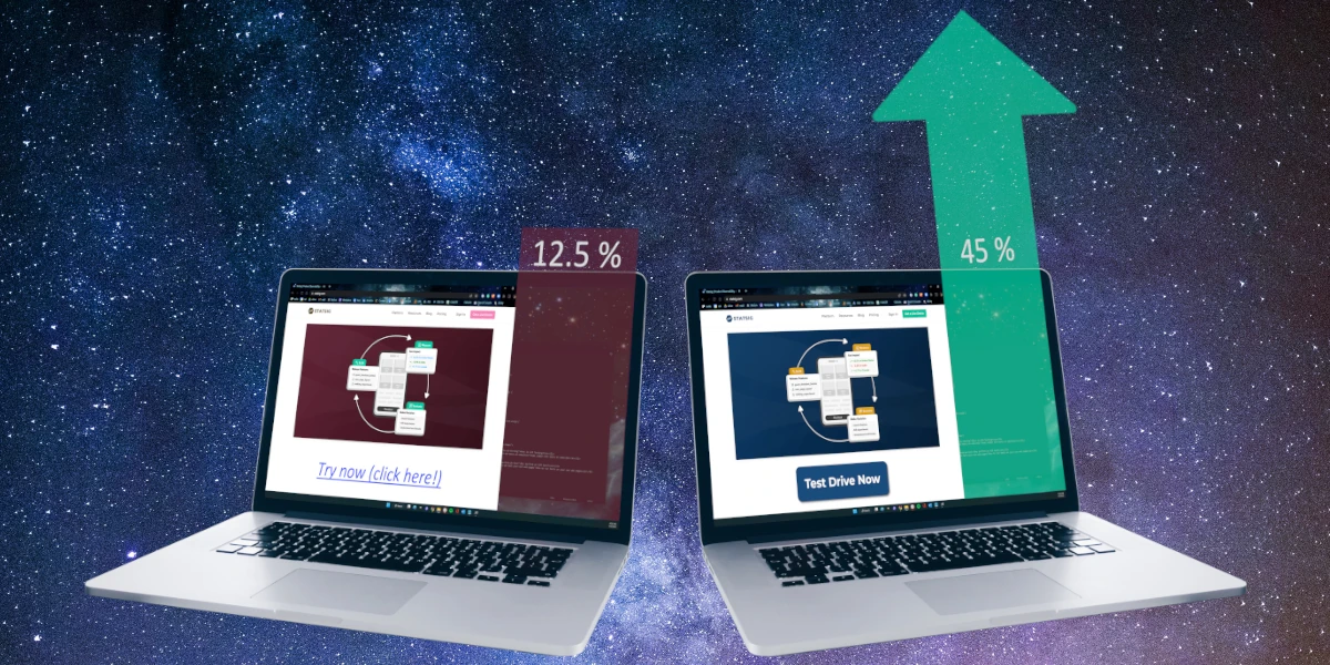
For instance, our friends at YoYoFuMedia earned a client 28% more revenue on their Shopify site by simply changing the sitewide “complete purchase” button from grey to gold.

Some common A/B tests on websites
Buttons
Buttons are probably the #1 A/B-tested website component to date. Tons and tons of studies have been done about which colors convey which emotions in marketing, and just about every brand has done its own testing of button colors.
But there’s also button text. Some buttons are no-brainers like “add to cart,” or “checkout,” but what about the lesser-frequented CTAs like submitting a support ticket? What about the “heavy lift” CTAs like demo-request buttons?
Fun fact: Our demo button didn’t always say “Get a live demo.” We actually used Autotune to test variants like “Schedule Live Demo” and “Chat with us.”
Buttons are pretty straightforward to change on just about any site, and there’s no shortage of studies promising big payoffs simply by nailing the button color/text combo. Just make sure to experiment with other aspects too!
Images
Images are tough, and it’s hard to predict how a given audience is going to react to an image. The metrics used to determine a “winner” is usually just simple engagement metrics: Time on page, pages per session, bounce rate, etc.
What makes images difficult is that, unless it’s an infographic, the image will be subject to some qualitative, opinion-based scrutiny from viewers; there’s just no right or wrong image.
Some website visitors—who would otherwise be perfect leads—might not like a specific type of flower (or cloud) on your website, so they bounce. Bummer.
Page layout
A bit of a bigger lift than images or buttons, some A/B tests experiment with shifts in entire layout and page order. Sometimes it’s simple, like swapping the position of two sections with one another. Other times it’s complicated, and involves dividing an entire web page into sections, and displaying those in varying orders.
Scroll through Intuit’s homepage as an example: As of January 2023, their products appear in the order
Turbotax
Credit Karma
Mint
Quickbooks
Mailchimp
If you think that specific order was determined simply by guesstimating user intent, think again.

Headings
Although not particularly advisable for blogs and other long-form content, many simple A/B tests are responsibly conducted on core web pages to determine which headings are most impactful.
This is most often done on landing pages. The ol’ marketing 101 handbook dictates that two, nearly-identical landing pages (except for headings/titles) should be created, and then ads and paid traffic can be diverted equally to both of them.
Paid traffic is usually used for this type of landing page testing because it’s a relatively immediate way to get website traffic, and is independent of SEO and organic growth. In fact, having two nearly-identical web pages is a no-no by SEO standards.
Once a winning heading configuration becomes obvious, the old page is deleted, and 301’d to the new page, and ad traffic is changed to solely target the winning page.
Colors
Websites and brands often A/B test colors. This is done by brand designers, web developers, CROs, rogue marketers who want to try a new Photoshop technique, and so on.
Officially, most brands have specific color palettes to use for their dotcom presence, but even then, there’s often leeway to switch and swap simple colors and mood graphics and measure their effects.
Unlike the more tangibly measured components such as buttons, color tests are usually done gradually, and simple metrics like bounce rate and time on the page might be the leading metrics for making a decision about color.
Join the Slack community

Why perform an A/B test?
Across marketing, engineering, customer experience, and virtually every discipline, there are tons of reasons a company would run an A/B test. For marketing, testing web page and landing page variants is a common use case, whereas engineering teams might focus on validating product hypotheses or measuring the impact of new features.
Regardless of the use case, an A/B test is truly only used for one simple thing: To compare two (or more) things and determine which one is *better.
A couple of caveats, though. First, it’s not always easy to compare two things head-to-head and get identical data. A few things can throw data off, including:
Audience: Imagine A/B testing a marketing email. Naturally, one variant will be sent to one audience and one will go to another audience. However, an audience is made up of individual people who are each unique in their own ways: While two audiences can be demographically identical, the people that compose them are not identical. The disparities in demographically-similar audiences’ behaviors can usually be smoothed out by simply increasing the sample size.
Pro tip: Use a sample size calculator to determine the right size to get statistically significant results.
Timing: Simply put, users behave differently at different times. This applies to time of day, weekday, and even seasonality (like new software being purchased at the beginning of fiscal years). When testing marketing stuff like web pages or emails, make sure the tests are happening concurrently, otherwise you will likely incur bias.
Experiment issues and data pollution: This one is a bit general, as each specific website A/B test will have its own unique variables. For example purposes, let’s say we’re changing a homepage graphic and measuring its effect on requests for a demo. If users are confused by the changes and click the request a demo button anyway, or if the demo button itself isn’t configured properly, the results will be polluted and unusable.
External factors: Numerous things outside of the market norm can interfere with the results of your A/B test, including economic issues, competitors running a sale, political factors, media distractions (launching a test during the Super Bowl), website outages, and more. Some of these are unpredictable, whereas others can be accounted for with a little bit of research ahead of time.
Other user biases: Simply put, there is a myriad of seemingly-small factors that can interfere with test data. Statsig uses CUPED to deliver laser-accurate, unbiased results. We’re always happy to describe how CUPED works, and how Statsig users benefit from it.
Also, a website A/B test is a way to compare two page designs and determine which one is better, but “better” is a subjective term. It is up to the experimenter to determine what “better” actually means in the context of each experiment.
Introducing Statsig Warehouse Native

Choosing the right metrics for your test
Again, common metrics for website A/B tests are things like conversion rate, bounce rate, time on page, pageviews per user, and so on. However, sometimes making changes may produce adverse effects.
For example, if your designers cook up the most compelling web page ever, and every user who lands on it instantly requests a demo of your product, that means your pageviews per user and time on page are going to decrease. It’s up to you to decide if that’s a good thing.
Related: Statsig’s guide on how to approach picking metrics for an experiment.

How to run tests on your own web pages
Good news, marketers: You can run A/B and A/B/n tests on your web pages with a Statsig account. Oh, and if you use Statsig Sidecar, there's no coding required.
Sidecar no-code A/B testing

Setup takes five minutes or less. To get started A/B testing your web pages with Statsig Sidecar, you'll need to:
Add the Chrome Extension: Find the Statsig Sidecar Chrome extension and add it to your browser.
Create a Statsig account: If you don't already have one, now's the time. They're free.
Enter your API keys: Statsig Sidecar will give you API keys that you'll need to add to the Sidecar Chrome extension.
Make changes: This is the fun part! Use Statsig Sidecar's intuitive click-and-change interface to make edits directly to your web page.
Paste the code onto your site: Back in your Statsig account, you'll need to start the experiment, and paste the code it gives in into the <head> of your site.
Check out the Statsig Sidecar quick-start guide for more info.
Get started now!

Related reading: B2B experimentation examples from the pros.


