Products
Solutions
Resources


Analyzing an experiment is a common task for analysts, data scientists, and product managers.
Experiments that randomly change a product for a subset of users are a powerful measurement tool for understanding if a change is working as intended, and running statistical analysis on the results allows you to understand if the results are meaningful.
Inputs
To analyze an experiment, you’ll need exposure data and metric data. Exposures should have been logged when the product “decided” which experience should be used, and will usually be logged every time. Your data will need to have:
A timestamp for the exposure
An identifier for your experimental unit (e.g. a userID)
An identifier for the experiment you’re analyzing
An identifier for which group/experience the unit was assigned to
You’ll also need some kind of outcome metric to analyze. The metrics you choose should be able to tell you if the experiment changed the experience as expected (e.g., more clicks when you make a checkout button bigger), and also if any downstream impact occurred (e.g., more revenue from more checkout button clicks).
You can roll this up as you’d like - event level or user-day level are common formats. The format you need in order to analyze an experiment will require:
A timestamp for the metric
The value of the metric
An Identifier for your experimental unit (e.g. a userID)
How to run the analysis
For basic experimental analysis in Databricks, we’ll assume you have this data in tables and that you’re using a Python notebook with Spark. We’ll walk you through the basic steps to get an analysis completed—note that there are some edge cases we won’t cover here in order to keep things succinct. We’ll talk about advanced cases at the end.
The high-level flow is to find metrics that were on exposed users after they were exposed—and therefore impacted by your change—and then aggregate those metrics at a user level, then a group level. With group statistics calculated you can easily run a standard Z or T test on your outputs.
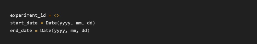
Step 0:
Set up your analysis. We recommend making this into a Databricks job with notebook parameters, so that you can easily rerun your analysis.
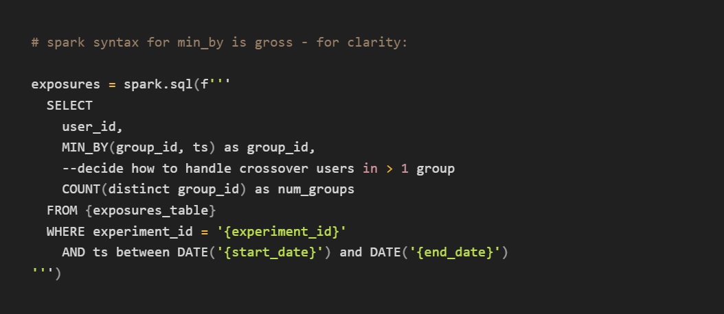
Step 1:
Find the first exposures. You’ll need to identify the first time a user saw an experiment in order to identify the relevant metric data.
Step 2:
Join to your metric data
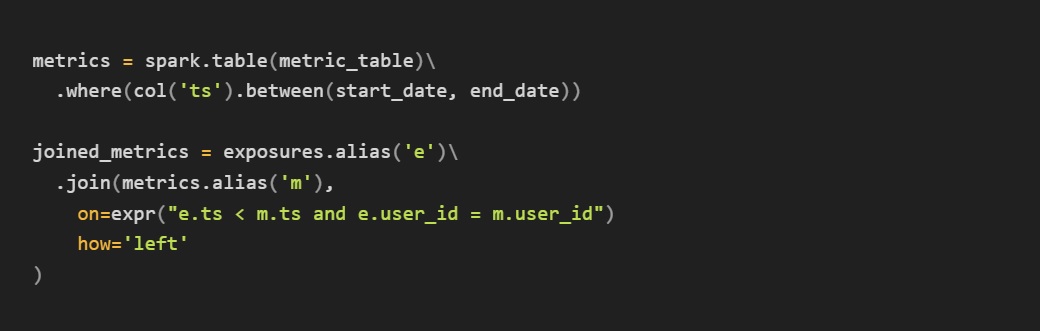
Now you have a nice staging dataset with all of the relevant experimental data. For a basic analysis—say an experiment where we’re counting page loads and button clicks—we can roll this up and perform our analysis with basic operators.
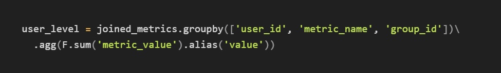
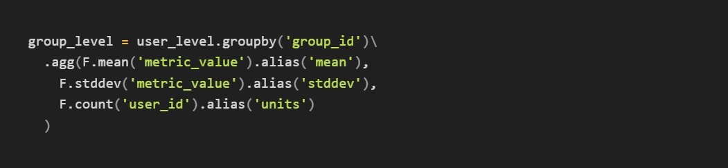
Step 3:
Aggregate data
Note that for smaller datasets, once you have the user_level data scipy or similar packages can easily run t-tests for you using functions like ttest_ind. You can just pull the user_level dataframe into lists of metric_values for the two groups and plug them in.
For larger datasets, it makes more sense to process the data using spark and plug in summary statistics at the end using a function like ttest_ind_from_stats
Discussion
For a lot of basic experiments, the above is a useful setup that makes custom analysis easy. There are a number of issues you may run into, and we’d like to discuss/offer some solutions.
Get a free account

Outliers
Often a bad actor, bot, or logging bugs will cause some extreme values in your user-level data. Because experimental analysis generally uses means, these can ruin your results—one person with 10000 button clicks will make whatever group they are in the “winner.”
Two common solutions to this are winsorization and cuped. Winsorization works by picking a percentile of each metric’s data—say P99.9—and capping any values above P99.9 to the P99.9 value. This reduces the impact of extreme outliers. CUPED works by adjusting a unit’s metrics based on the data observed before the experiment started. This is very powerful, but is more complex and requires pre-exposure data which is not always a possibility (e.g. a new-user experiment).
Ratio/correlated components
Ratio metrics require you to use the Delta Method to account for the fact that there is likely some correlation between the numerator and denominator. For example, if you are measuring “CTR,” it’s likely that the numerator (clicks) is correlated with the denominator (visits) in many experiments. The adjustment is not too complex, but you’ll have to calculate the covariance between the numerator and denominator of the metric.
Metric types
Different types of metrics—such as retention, user accounting, and funnels—all require different and more complex computation. You’ll want to check in on best practices here, and consider when there may be a ratio involved.
Statsig Warehouse Native
This guide was a quick primer on how to get started running experiments in Databricks. Statsig Warehouse Native was built by Statsig to seamlessly plug into your Databricks warehouse and run complex calculations for you with a simple interface.
We take care of health checks, calculation types, outlier control, and offer a powerful suite of collaboration tools between eng, product, and data. Check out our warehouse-native solution to see if it's right for you!
Request a demo

Related Reading: