Products
Solutions
Resources


We recently embarked on a journey to make our Settings page even better.
Over the past few years, Statsig has scaled significantly, adding multiple products and features to our platform. As a result, Settings has become overly complicated to navigate. To ensure a broad range of users can access important settings for their teams, projects or organizations, we had to rethink the Settings experience from the ground up. This ultimately resulted in three core outputs:
Intuitive navigation (Product first, permission level second)
Settings 2.0 gives product configuration a first-class treatment while allowing users to easily navigate between different permission-level settings using a sub-navigation menu.

In Settings 1.0, the left-side navigation menu was essentially broken down into "project" and "organization."
If users wanted to edit settings for a feature gate, for example, they needed to remember which settings were considered project settings versus organization settings, often resulting in users having to navigate different tabs just to track down one toggle.
This caused some confusion, with feature gate-related settings scattered across three different tabs:
Members > Select a Team > Edit Team Settings
Project Info
Organization Info > Gate Settings
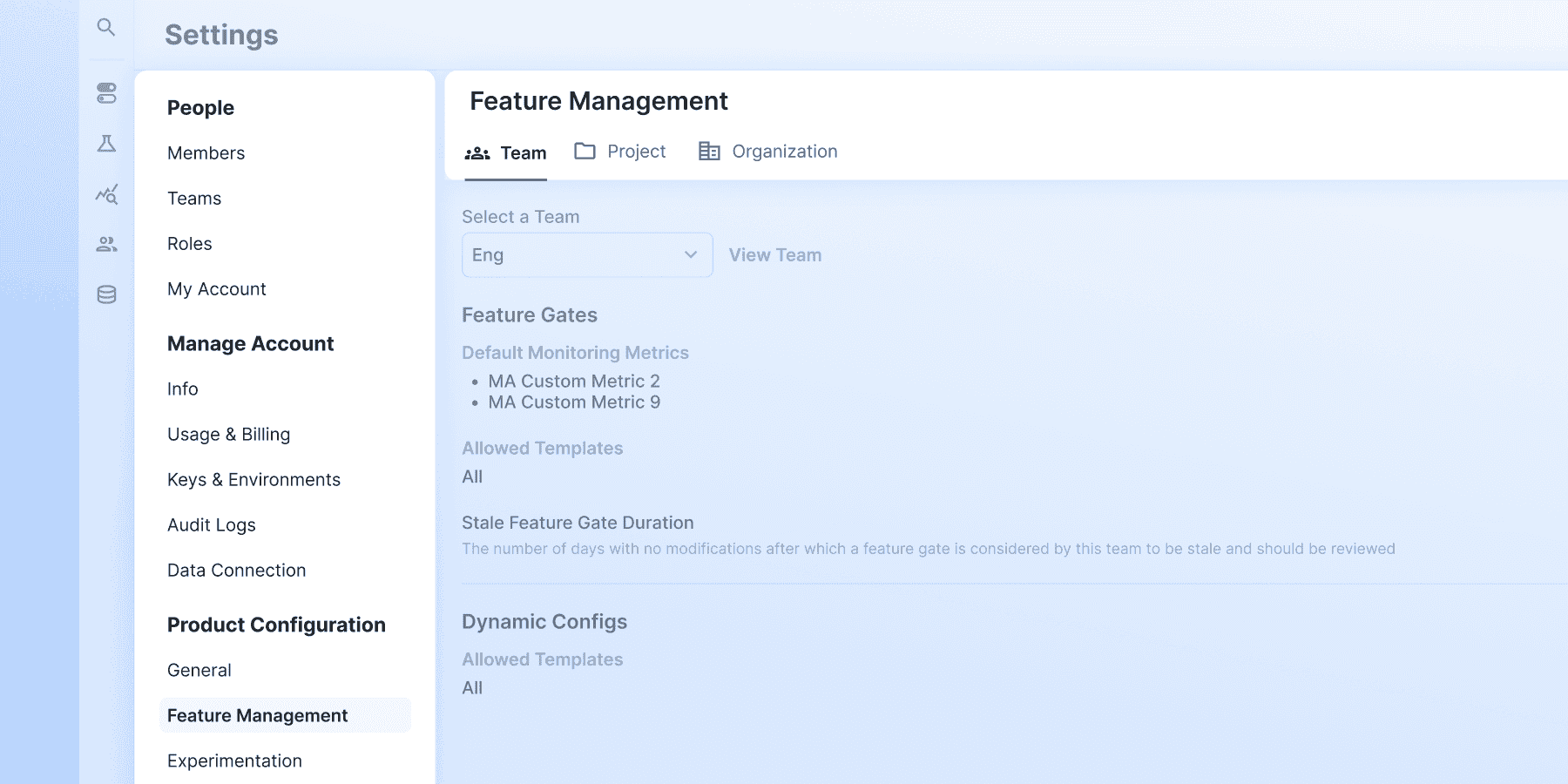
The revamped navigation in Settings 2.0 gives product configuration a first-class treatment, allowing users to easily navigate between different permission-level settings:
Settings 2.0 introduces a main navigation and a sub-navigation
Users can easily switch between Team, Project, and Organization settings for product features by using the sub-navigation

Consolidating members, teams, and roles
In Settings 1.0, Members, Teams and Roles settings were nested in a single table under the Members” tab, making certain settings hard to access. For example, the Team Settings page was four clicks away from the Settings landing page.

Given the frequent usage and importance of these settings, we promoted them to a front-and-center position in Settings.

Further, with the sub-navigation system, users can easily manage project-level or organization-level permission settings without clicking away from the main tab.
UI simplification
We updated the UI in Settings 2.0 to improve usability while adhering to our latest design system, Pluto.

In September 2024, we unveiled Pluto, which helps maintain product intuitiveness despite greater platform complexity. Since then, we've been gradually rolling out design changes to the console UI to make it adherent to Pluto's standards.
As of today, nearly all Settings 2.0 pages adhere to Pluto designs.
The simplified UI makes complex settings more digestible and also offers a more coherent user experience across the product.
Maintaining an intuitive Settings experience for an every-growing platform is an ongoing project.
Stay tuned for more updates in the future.
Request a demo